Cumulative frequency distribution is a way of summarizing and displaying data in a graphical or tabular form. It shows the total number of observations in a dataset that are less than or equal to a given value. This concept is useful for understanding the distribution of data and analyzing it at different points. In this article, we will explore the different aspects of cumulative frequency distribution, including what it is, how to create cumulative frequency tables, types of cumulative frequency distributions, and their graphical representation.
What is Cumulative Frequency Distribution?
Cumulative frequency distribution is a record of the number of data points that fall within specified ranges or intervals, called classes. The cumulative frequency is the sum of the frequencies of all the classes up to and including a given class. For example, if we have a dataset of ages for 100 people, we can create a cumulative frequency distribution table by grouping the ages into classes and recording the number of people in each class. The cumulative frequency would be the sum of the frequencies of each class up to and including the class being considered.
Drawing a Cumulative Frequency Distribution Table
To create a cumulative frequency distribution table, follow these steps:
- Determine the class intervals for the data.
- Count the number of data points in each class interval.
- Calculate the cumulative frequency for each class by adding the frequencies of all the previous classes to the frequency of the current class.
By following these steps, you can create a comprehensive table that displays the cumulative frequency distribution of your data.
|
Class Interval |
Frequency |
Cumulative Frequency |
|
10 - 19 |
3 |
3 |
|
20 - 29 |
5 |
3 + 5 = 8 |
|
30 - 39 |
4 |
8 + 4 = 12 |
|
40 - 49 |
2 |
12 + 2 = 14 |
|
50 - 59 |
2 |
14 + 2 = 16 |
|
60 - 69 |
1 |
16 + 1 = 17 |
|
70 - 79 |
1 |
17 + 1 = 18 |
Type of cumulative frequency distribution:
There are two types of cumulative frequency distributions: less than cumulative frequency and more than cumulative frequency. Less than and more than cumulative frequencies are statistical concepts that describe the distribution of a data set. They provide a way to represent data in a summarized form and can be useful in making decisions based on the data. In this article, we will explain what less than and more than cumulative frequencies are and how they are obtained.
Less than cumulative frequency: This type of cumulative frequency distribution shows the number of data points that are less than a specified value. To calculate this, you can add up the frequencies of all data points that are less than the specific value.
In this table, we arrange data into classes and count the number of values that are less than the upper limit of each class.
To create a less than frequency distribution table, follow these steps:
- Step 1.Determine the range of data: To create a frequency distribution table, first determine the range of your data set.
- Step 2.Divide the range into classes: Divide the range into classes with equal intervals. Choose the number of classes based on the size of your data set.
- Step 3. Determine the upper limit of each class: The upper limit of each class is the highest value that can belong to that class.
- Step 4.Count the number of data values that are less than the upper limit of each class: This is known as the cumulative frequency.
- Step 5. Create the table: Arrange the cumulative frequencies into a table with classes in the left column and cumulative frequencies in the right column.
Here is an interesting example to illustrate this process:
Suppose you have a data set of 100 students’ heights in centimeters. To create a less than frequency distribution table, you can follow these steps:
- Step 1. Determine the range of data: The heights range from 140 cm to 200 cm.
- Step 2.Divide the range into classes: You can divide the range into classes with a width of 10 cm.
- Step 3.Determine the upper limit of each class: The upper limit of each class is the highest value that can belong to that class.
|
Classes (in cm) |
Upper Limit |
|
140-149 |
149 |
|
150-159 |
159 |
|
160-169 |
169 |
|
170-179 |
179 |
|
180-189 |
189 |
|
190-199 |
199 |
|
200-209 |
209 |
Step 4. Write the frequency of each class:
|
Classes (in cm) |
Upper Limit |
Number of students (Frequency) |
|
140-149 |
149 |
10 |
|
150-159 |
159 |
15 |
|
160-169 |
169 |
15 |
|
170-179 |
179 |
20 |
|
180-189 |
189 |
20 |
|
190-199 |
199 |
10 |
|
200-209 |
209 |
10 |
Step 5: Create the table:
The final less than frequency distribution table is as follows:
|
Classes (in cm) |
Upper Limit |
Number of students (Frequency) |
Cumulative Frequency |
|
140-149 |
149 |
10 |
10 |
|
150-159 |
159 |
15 |
25 |
|
160-169 |
169 |
15 |
40 |
|
170-179 |
179 |
20 |
60 |
|
180-189 |
189 |
20 |
80 |
|
190-199 |
199 |
10 |
90 |
|
200-209 |
209 |
10 |
100 |
This table shows that 10 students are less than 149 cm tall, 25 students are less than 159 cm tall, 40 students are less than 169 cm tall, and so on.
In conclusion, a less than frequency distribution table is a useful tool for summarizing and visualizing data. By following the steps outlined above, you can create your own less than frequency distribution table and gain valuable insights into your data.
More / greater than cumulative frequency: This type of cumulative frequency distribution shows the number of data points that are greater than a specified value. To calculate this, you subtract the cumulative frequency of all data points that are less than or equal to the specific value from the total frequency.
Here is an interesting example to illustrate this process:
Suppose you have a data set of 100 students’ heights in centimetres. To create a more than frequency distribution table, you can follow these steps:
- Step 1. Determine the range of data: The heights range from 140 cm to 200 cm.
- Step 2.Divide the range into classes: You can divide the range into classes with a width of 10 cm.
- Step 3.Determine the lower limit of each class: The lower limit of each class is the lowest value that can belong to that class.
|
Classes (in cm) |
Lower Limit |
|
140-149 |
140 |
|
150-159 |
150 |
|
160-169 |
160 |
|
170-179 |
170 |
|
180-189 |
180 |
|
190-199 |
190 |
|
200-209 |
200 |
Step 4. Write the frequency of each class:
|
Classes (in cm) |
Lower Limit |
Number of students (Frequency) |
|
140-149 |
140 |
10 |
|
150-159 |
150 |
15 |
|
160-169 |
160 |
15 |
|
170-179 |
170 |
20 |
|
180-189 |
180 |
20 |
|
190-199 |
190 |
10 |
|
200-209 |
200 |
10 |
Step 5: Create the table:
The final less than frequency distribution table is as follows:
|
Classes (in cm) |
Lower Limit |
Number of students (Frequency) |
Cumulative Frequency |
|
140-149 |
140 |
10 |
100 |
|
150-159 |
150 |
15 |
90 |
|
160-169 |
160 |
15 |
75 |
|
170-179 |
170 |
20 |
60 |
|
180-189 |
180 |
20 |
40 |
|
190-199 |
190 |
10 |
20 |
|
200-209 |
200 |
10 |
10 |
This table shows that 100 students are more than 140 cm tall, 90 students are more than 150 cm tall, 75 students are more than 160 cm tall, and so on.
Graphical representation of more than and less than cumulative frequencies:
The cumulative frequency distribution can be represented graphically using either a less than cumulative frequency graph or a more than cumulative frequency graph.
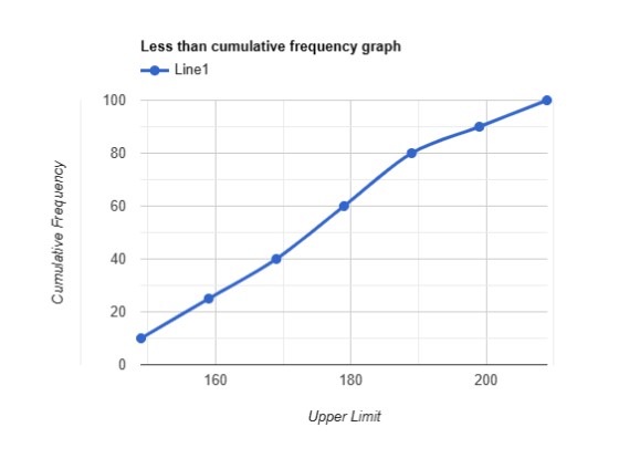
Less than cumulative frequency graph/curve:This type of graph is often called an Ogive, and it is represented by plotting the cumulative frequency on the y-axis and the data points (upper limits) on the x-axis. The graph shows the number of data points that are less than a specified value.
Consider this table, for example,
|
Classes (in cm) |
Upper Limit (x-axis) |
Number of students (Frequency) |
Cumulative Frequency (y-axis) |
|
140-149 |
149 |
10 |
10 |
|
150-159 |
159 |
15 |
25 |
|
160-169 |
169 |
15 |
40 |
|
170-179 |
179 |
20 |
60 |
|
180-189 |
189 |
20 |
80 |
|
190-199 |
199 |
10 |
90 |
|
200-209 |
209 |
10 |
100 |
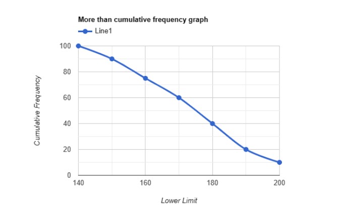
More than cumulative frequency graph/curve: This type of graph is represented in the same way as a less than cumulative frequency graph, but it shows the number of data points that are greater than a specified value.
Consider this table, for example,
|
Classes (in cm) |
Lower Limit |
Number of students (Frequency) |
Cumulative Frequency |
|
140-149 |
140 |
10 |
100 |
|
150-159 |
150 |
15 |
90 |
|
160-169 |
160 |
15 |
75 |
|
170-179 |
170 |
20 |
60 |
|
180-189 |
180 |
20 |
40 |
|
190-199 |
190 |
10 |
20 |
|
200-209 |
200 |
10 |
10 |
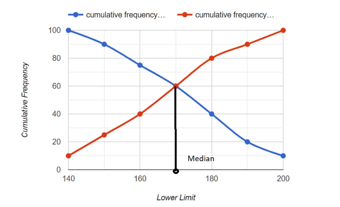
Finding the median of a particular data collection is made easier with the use of these graphs. Drawing both kinds of cumulative frequency distribution curves on the same graph provides the median. The median of the provided set of data is determined by the value at the point where both curves meet.
Use of cumulative frequency:
- Cumulative frequency distribution is used in statistics to analyze and summarize the data. It helps to find the distribution of a given set of data and understand the pattern of the data. The cumulative frequency distribution is used in a variety of fields such as sociology, finance, engineering, and healthcare to name a few.
- One of the most common uses of cumulative frequency distribution is to determine the probability of a value being less than or equal to a given value. For example, in a study of height, the cumulative frequency distribution of height can be used to find the probability of a person being less than or equal to a certain height.